library(igraph)
library(ggraph)
library(graphlayouts)
library(ggforce)
library(networkdata)13 Enhancing Visualizations
The previous chapters covered the core building blocks of ggraph including layouts, node and edge geoms, and techniques for visualizing specific network types. With those tools alone, you can already produce clear, publication-ready network plots. This chapter goes a step further, showing how to combine ggraph with companion packages like ggforce and how to apply a number of small but effective tricks that address common visualization challenges.
13.1 Packages Needed for this Chapter
As before, we use the Game of Thrones dataset using some preprocessing steps.
data("got")

gotS1 <- got[[1]]

got_palette <- c(
  "#1A5878",
  "#C44237",
  "#AD8941",
  "#E99093",
  "#50594B",
  "#8968CD",
  "#9ACD32"
)

# compute a clustering for node colors
V(gotS1)$clu <- as.character(membership(cluster_louvain(gotS1)))

# compute degree as node size
V(gotS1)$size <- degree(gotS1)
13.2 Combining ggraph and ggforce
The ggforce package and ggraph work pretty nicely together. For example, you can use the geom_mark_*() functions to highlight clusters. Figure 13.1 shows the result.
set.seed(1108)

# create network with a group structure
g <- sample_islands(9, 40, 0.4, 15)
g <- igraph::simplify(g)
V(g)$grp <- as.character(rep(1:9, each = 40))ggraph(g, layout = "backbone", keep = 0.4) +
geom_edge_link0(edge_color = "grey66", edge_linewidth = 0.2) +
geom_node_point(aes(fill = grp), shape = 21, size = 3) +
geom_mark_hull(
aes(x, y, group = grp, fill = grp),
concavity = 4,
expand = unit(2, "mm"),
alpha = 0.25
) +
scale_color_brewer(palette = "Set1") +
scale_fill_brewer(palette = "Set1") +
scale_edge_color_manual(
values = c(rgb(0, 0, 0, 0.3), rgb(0, 0, 0, 1))
) +
theme_graph() +
theme(legend.position = "none")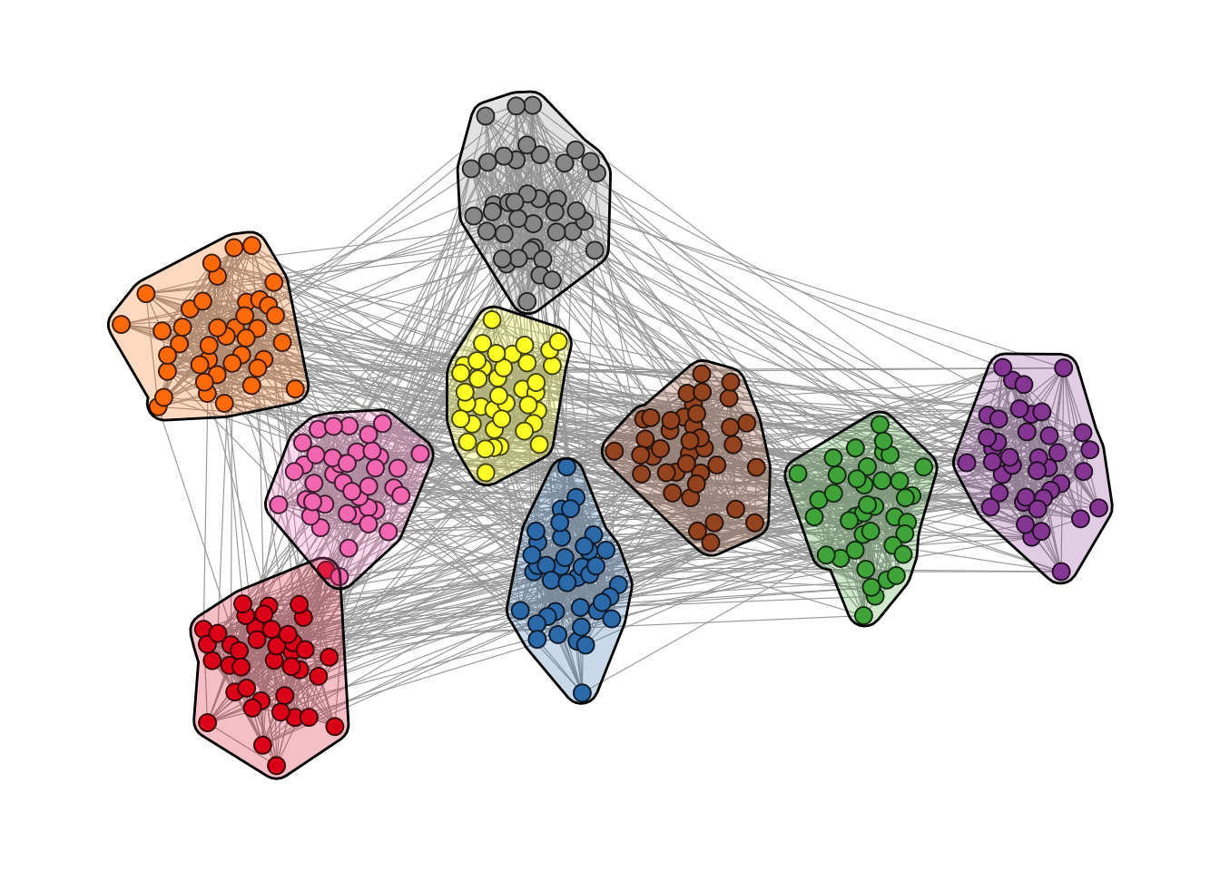
geom_mark_hull().
It is also possible to add labels to the clusters as shown in Figure 13.2.
ggraph(g, layout = "backbone", keep = 0.4) +
  geom_edge_link0(edge_color = "grey66", edge_linewidth = 0.2) +
  geom_node_point(aes(fill = grp), shape = 21, size = 3) +
  geom_mark_hull(
    aes(x, y, group = grp, fill = grp, label = grp),
    concavity = 4,
    expand = unit(2, "mm"),
    alpha = 0.25
  ) +
  scale_color_brewer(palette = "Set1") +
  scale_fill_brewer(palette = "Set1") +
  scale_edge_color_manual(
    values = c(rgb(0, 0, 0, 0.3), rgb(0, 0, 0, 1))
  ) +
  theme_graph() +
  theme(legend.position = "none")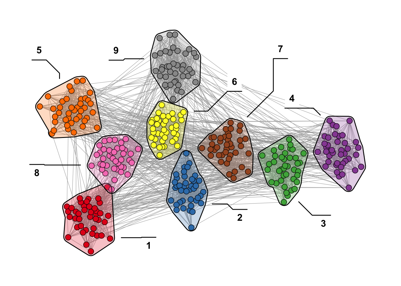
13.3 Polishing Details
When building network visualizations, a few recurring challenges tend to appear once plots become more complex: arrow endpoints that overlap with nodes, edges bleeding through transparent nodes, or labels that disappear into dense graphs. The following subsections address each of these issues with targeted techniques. Note that each problem certainly has multiple solutions, and the ones shown here just illustrate one possible approach.
13.3.1 Aligning Arrow Endpoints with Node Size
In directed networks where node size is mapped to an attribute, edges drawn with arrows often overlap with larger nodes. Figure 13.3 illustrates the problem: end_cap is set based on degree, but because ggraph maps the size aesthetic through a scale, the actual rendered size of each node does not match the value passed to end_cap.
set.seed(1108)
g <- sample_pa(30, 1)
V(g)$degree <- degree(g, mode = "in")

ggraph(g, "stress") +
  geom_edge_link(
    aes(end_cap = circle(node2.degree + 2, "pt")),
    edge_color = "black",
    arrow = arrow(
      angle = 10,
      length = unit(0.15, "inches"),
      ends = "last",
      type = "closed"
    )
  ) +
  geom_node_point(
    aes(size = degree),
    col = "grey66",
    show.legend = FALSE
  ) +
  scale_size(range = c(3, 11)) +
theme_graph()A solution is to bypass the size scale entirely using base R’s I() function, which passes values through “as is”. A node with value 5 will be rendered at exactly 5 points. Because I() removes any automatic rescaling, we need to normalise the degree values to the desired size range beforehand.
Figure 13.4 shows the result: the arrow endpoints now align properly with the node sizes, creating a cleaner and more accurate visualization of the directed network.
normalise <- function(x, from = range(x), to = c(0, 1)) {
  x <- (x - from[1]) / (from[2] - from[1])
  if (!identical(to, c(0, 1))) {
    x <- x * (to[2] - to[1]) + to[1]
  }
  x
}

# map degree to the desired point-size range
V(g)$degree <- normalise(V(g)$degree, to = c(3, 11))

ggraph(g, "stress") +
  geom_edge_link(
    aes(end_cap = circle(node2.degree + 2, "pt")),
    edge_color = "grey25",
    arrow = arrow(
      angle = 10,
      length = unit(0.15, "inches"),
      ends = "last",
      type = "closed"
    )
  ) +
  geom_node_point(aes(size = I(degree)), col = "grey66") +
  theme_graph()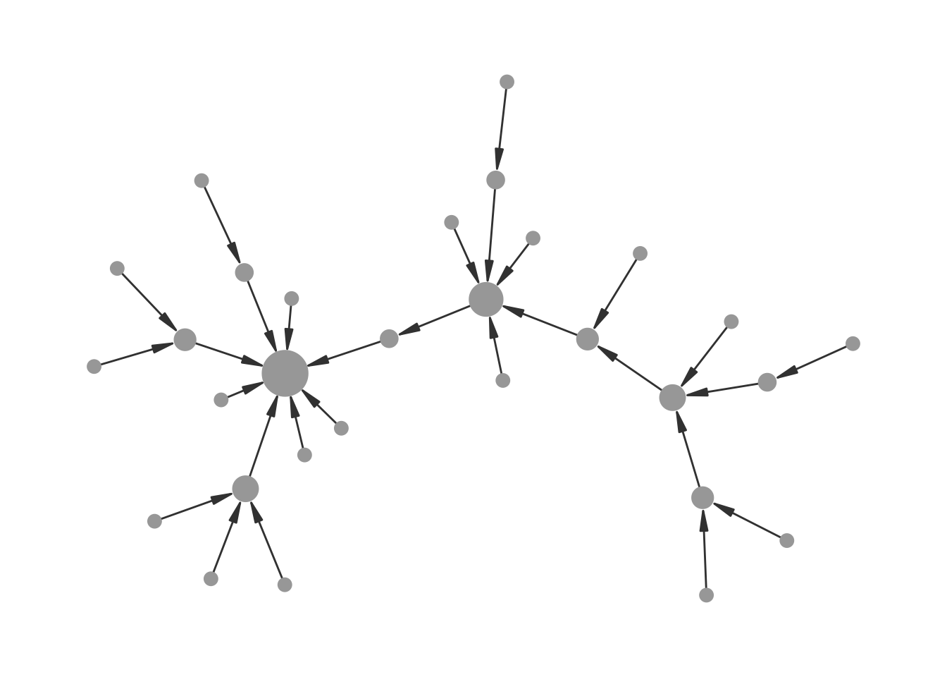
I() for node sizes.
13.3.2 Transparent Nodes Without Edge Bleed-Through
A useful principle in network visualization is that edges should not be drawn on top of nodes. Drawing edges before nodes in the layer stack normally takes care of this. However, when node opacity is mapped to an attribute, edges become visible through the semi-transparent nodes again, as shown in Figure 13.5.
set.seed(1108)
g <- sample_gnp(20, 0.5)
V(g)$degree <- degree(g)

ggraph(g, "stress") +
  geom_edge_link(edge_color = "grey66") +
  geom_node_point(
    size = 8,
    aes(alpha = degree),
    col = "red",
    show.legend = FALSE
  ) +
  theme_graph()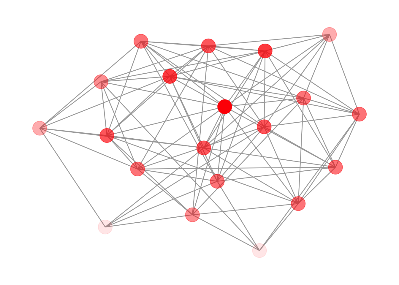
The fix is to add an extra node layer between the edges and the transparent nodes: a set of fully opaque points in the background color. These act as masks that hide the edges underneath, while the colored layer on top still shows the intended transparency effect. Figure 13.6 shows the result.
ggraph(g, "stress") +
  geom_edge_link(edge_color = "grey66") +
  geom_node_point(size = 8, col = "white") +
  geom_node_point(
    aes(alpha = degree),
    size = 8,
    col = "red",
    show.legend = FALSE
  ) +
  theme_graph()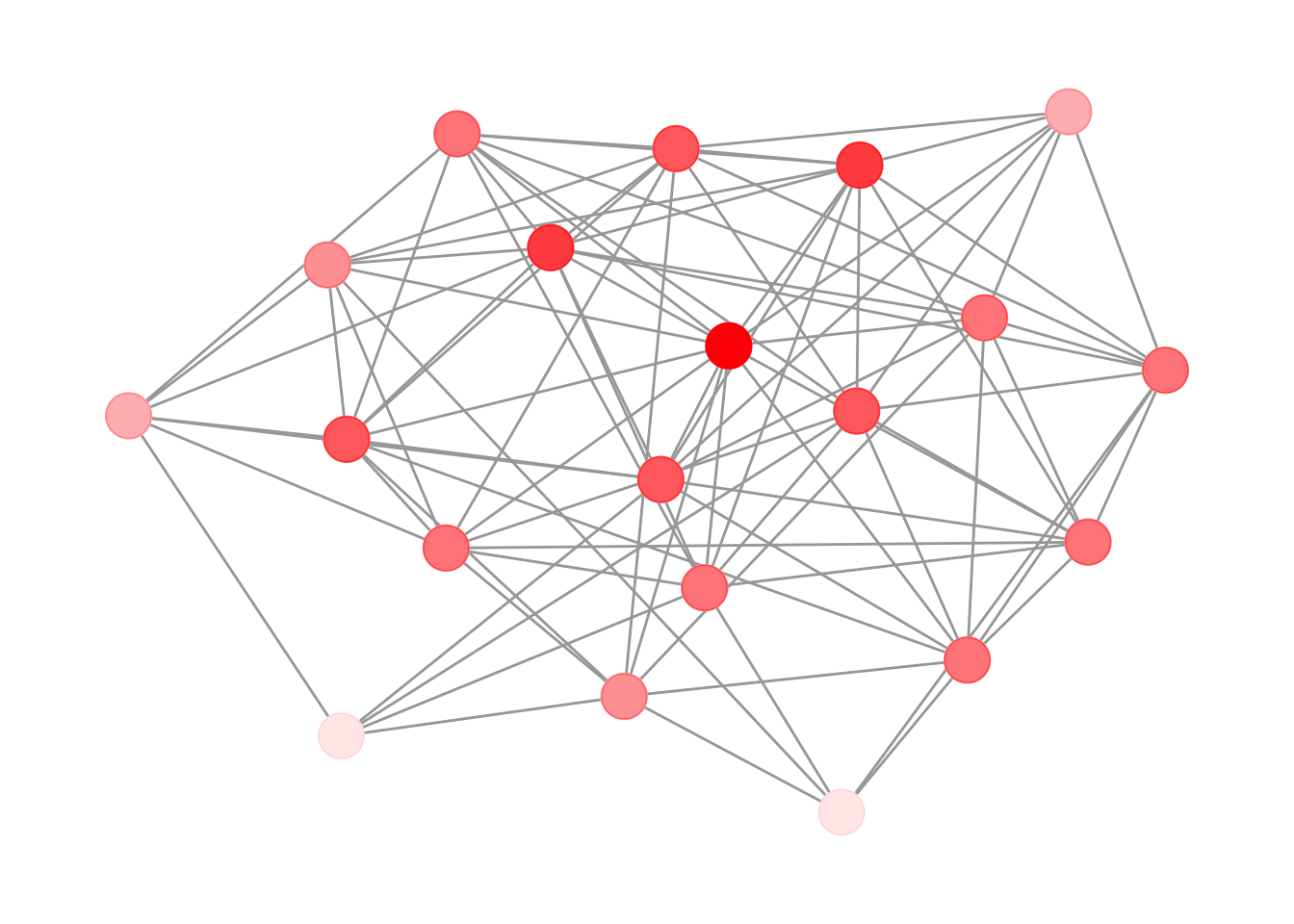
Note that the background color of the masking layer needs to match the plot background — in this case white, since theme_graph() uses a white background by default.
13.3.3 Improving Label Readability in Dense Networks
In dense networks, node labels can easily become unreadable when they overlap with edges and other nodes. Figure 13.7 shows a typical example where even bold labels are difficult to parse.
set.seed(1108)
g <- sample_gnp(50, 0.5)
V(g)$name <- sapply(1:50, function(x) {
  paste0(sample(LETTERS, 4), collapse = "")
})
E(g)$weight <- runif(ecount(g))

ggraph(g, "stress") +
  geom_edge_link0(
    aes(edge_color = weight, edge_linewidth = weight),
    show.legend = FALSE
  ) +
  geom_node_point(size = 8, color = "#44a6c6") +
  geom_node_text(aes(label = name), fontface = "bold") +
  scale_edge_color_continuous(low = "grey66", high = "black") +
  scale_edge_width(range = c(0.1, 0.5)) +
  theme_graph()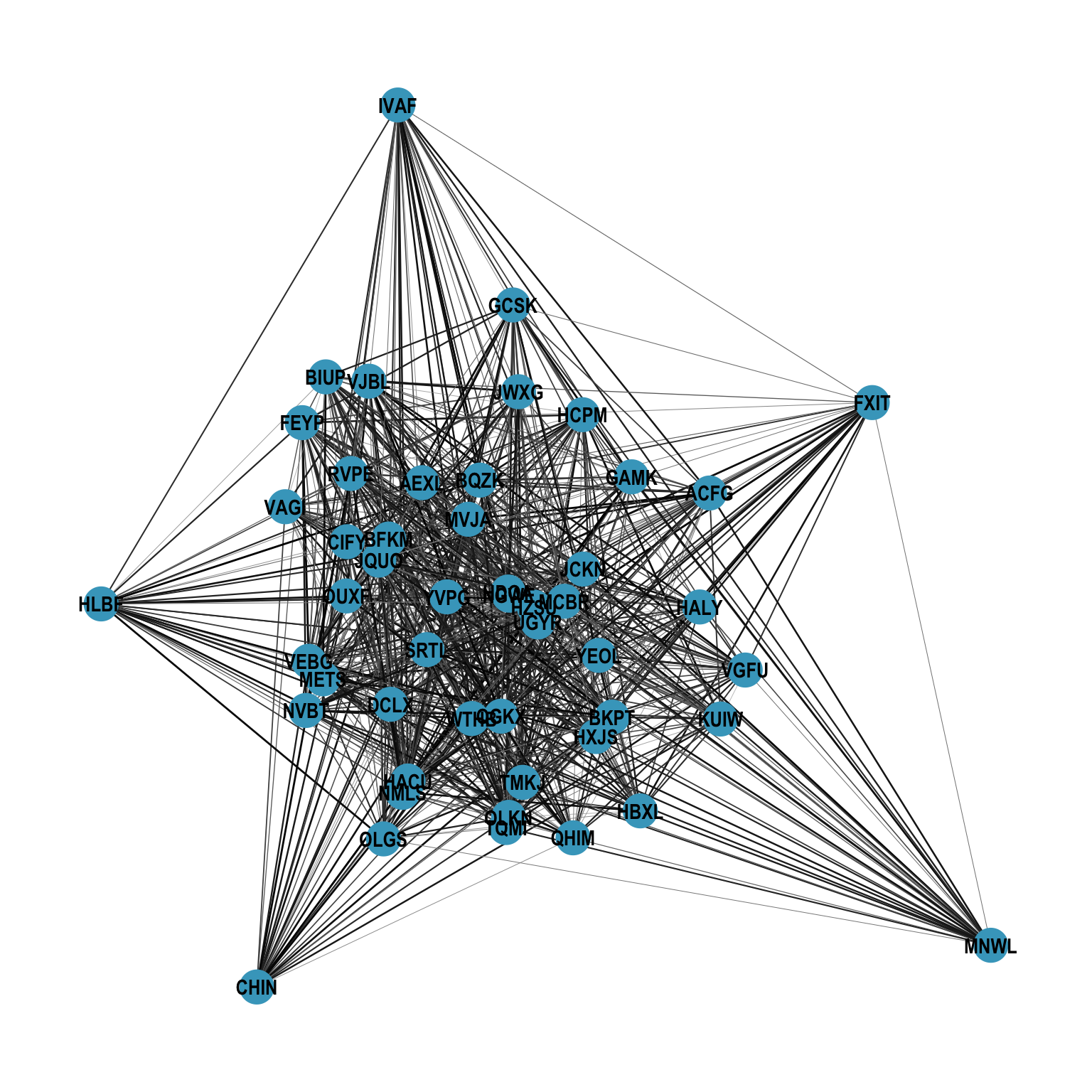
As noted in the basics chapter, the node layout is accessible to every layer, so we can reach for geoms from other packages that operate on standard x and y aesthetics. The shadowtext package provides geom_shadowtext(), which draws a colored halo behind each label, making it stand out against both edges and nodes, shown in Figure 13.8.
ggraph(g, "stress") +
  geom_edge_link0(
    aes(edge_color = weight, edge_linewidth = weight),
    show.legend = FALSE
  ) +
  geom_node_point(size = 8, color = "#44a6c6") +
  shadowtext::geom_shadowtext(
    aes(x, y, label = name),
    color = "black",
    size = 4,
    bg.color = "white"
  ) +
  scale_edge_color_continuous(low = "grey66", high = "black") +
  scale_edge_width(range = c(0.1, 0.5)) +
  theme_graph()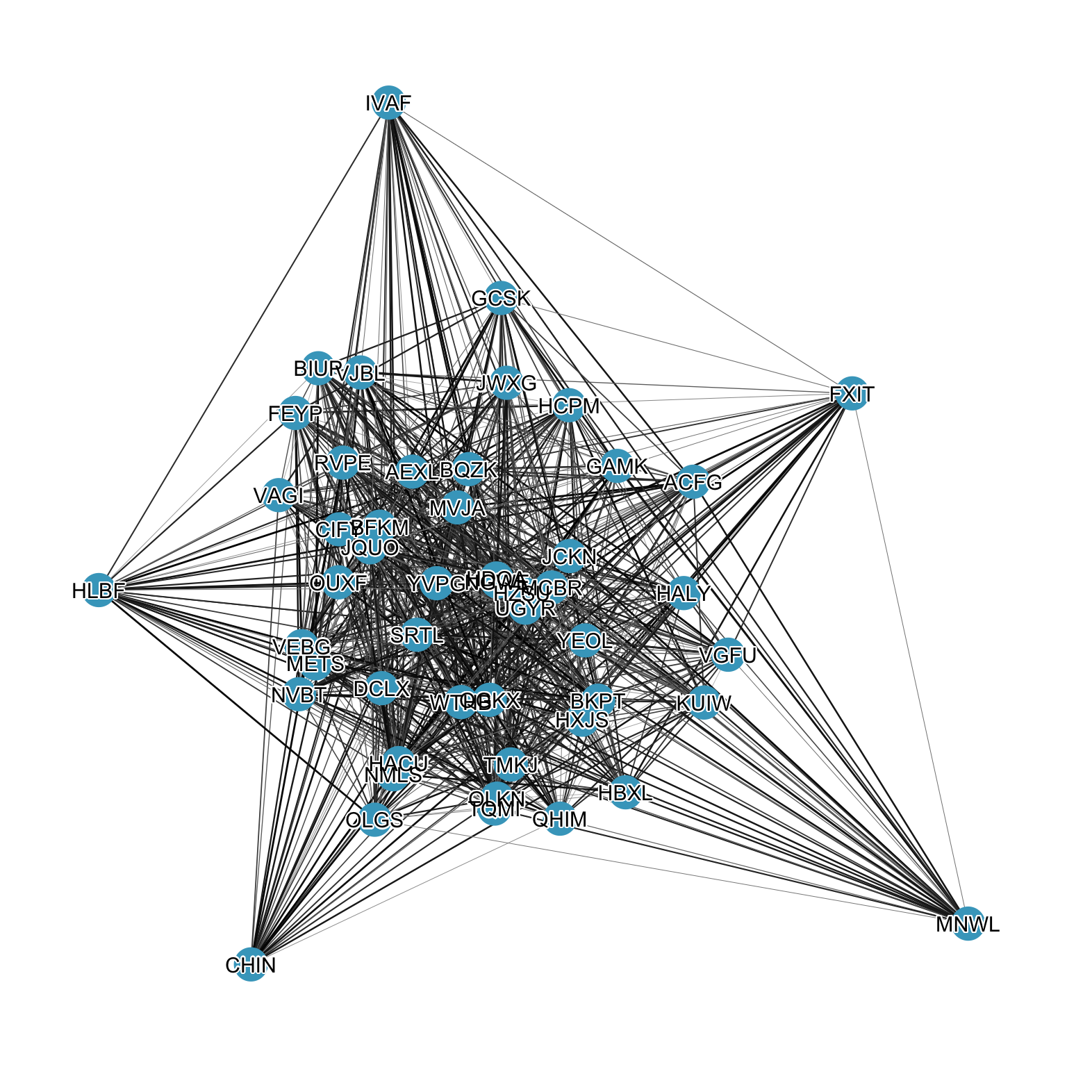
shadowtext.