library(igraph)
library(ggraph)
library(graphlayouts)
library(networkdata)11 Basics of ggraph
The ggraph package is an extension of ggplot2 designed specifically for visualizing network data. The package extends the grammar of graphics to handle network data, treating nodes and edges as separate geometric layers that can be styled independently. ggraph provides a framework for building network visualizations layer by layer. First, a layout is calculated that assigns coordinates to nodes, then edge and node geoms are drawn that define how connections are drawn, and nodes appear. This compositional approach makes it straightforward to create appealing visualizations while maintaining the flexibility and consistency that makes ggplot2 so powerful.
11.1 Packages Needed for this Chapter
11.2 Data Preparation
As a running example in this chapter, we use the network of character interactions in the first season of Game of Thrones (GoT). This dataset is included in the networkdata package. We also define a custom color palette, compute a clustering for node colors and compute degree as node size.
data("got")

gotS1 <- got[[1]]

got_palette <- c(
  "#1A5878",
  "#C44237",
  "#AD8941",
  "#E99093",
  "#50594B",
  "#8968CD",
  "#9ACD32"
)

# compute a clustering for node colors
V(gotS1)$clu <- as.character(membership(cluster_louvain(gotS1)))

# compute degree as node size
V(gotS1)$size <- degree(gotS1)
11.3 Grammar of graphics
To master ggraph you need to understand the basics of, or at least develop a feeling for, the grammar of graphics. The grammar is implemented in R through ggplot2 and provides a systematic framework for constructing visualizations by combining independent components. Rather than thinking of plots as pre-defined chart types, the grammar decomposes graphics into fundamental elements: data, aesthetic mappings, geometric objects, scales, and coordinate systems. This approach allows one to build complex visualizations layer by layer, making it easier to customize and extend plots. For networks, ggraph extends this grammar to handle the unique structure of graph data, treating nodes and edges as separate geometric layers that can be styled and composed independently.
Figure 11.1 shows a standard network plot created with ggraph. We will go through the code step-by-step in the following sections to understand how to use each component effectively.
ggraph(gotS1, layout = "stress") +
  geom_edge_link0(
    aes(edge_linewidth = weight),
    edge_color = "grey66"
  ) +
  geom_node_point(aes(fill = clu, size = size), shape = 21) +
  geom_node_text(
    aes(filter = size >= 26, label = name),
    family = "serif"
  ) +
  scale_fill_manual(values = got_palette) +
  scale_edge_width(range = c(0.2, 3)) +
  scale_size(range = c(1, 6)) +
  theme_graph() +
  theme(legend.position = "none")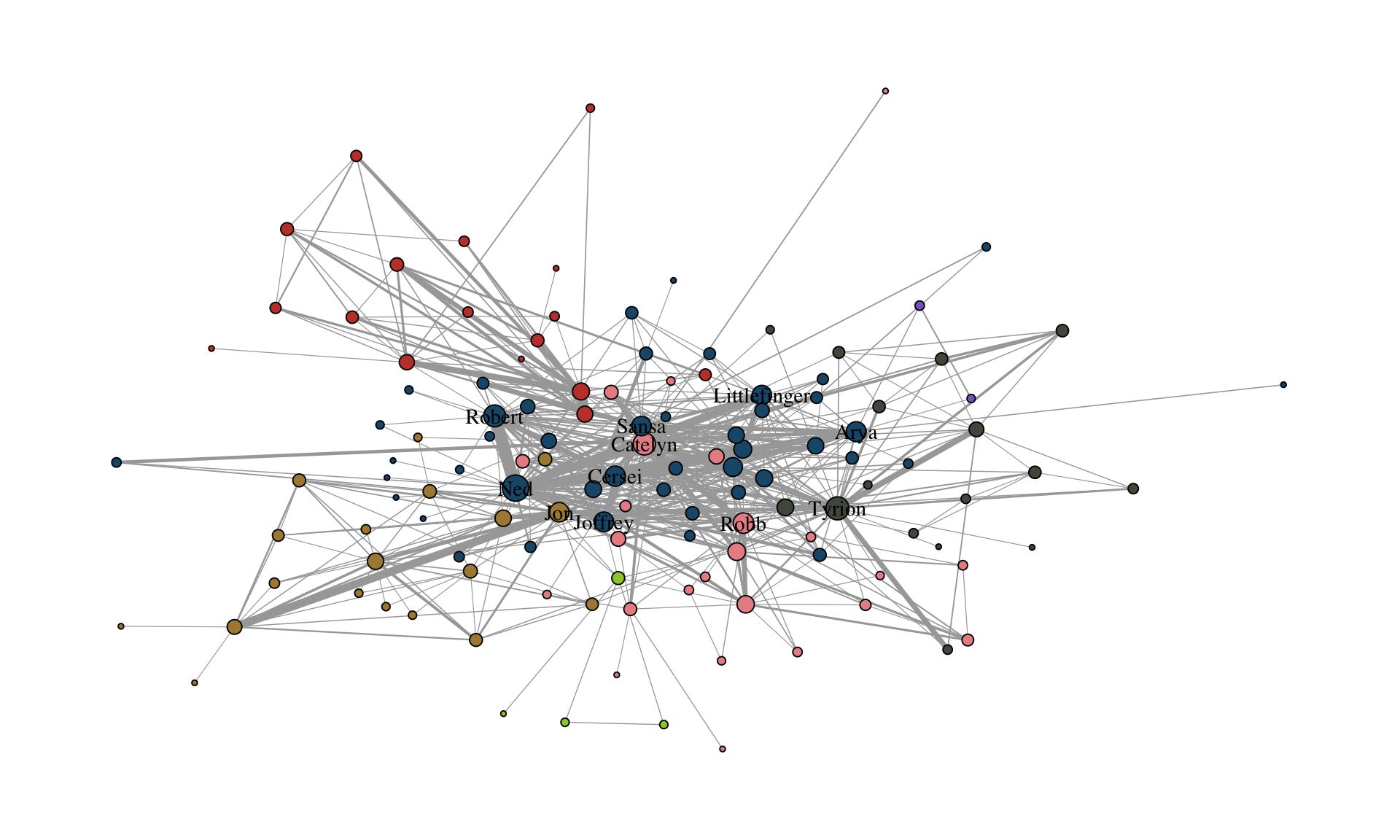
11.4 Layout
ggraph(gotS1, layout = "stress")The first layer includes the calculation of a layout. Unlike traditional data visualization where variables naturally map to x and y coordinates, networks usually lack inherent spatial positions. This makes choosing a layout algorithm the most fundamental decision in network visualization. Layout algorithms assign coordinates to nodes based on the network’s structure, aiming to reveal patterns and relationships that support your analytical goals.
The package graphlayouts provides a wide range of layout algorithms that can be used with ggraph. The “stress” layout for example is always a safe choice since it is deterministic and produces nice layouts for most standard networks. Beyond this fairly general layout, there are many more specialized algorithms which may be better suited for specific types of networks or analytical goals. These algorithms will be discussed later. The igraph package also provides a variety of standard layout algorithms that can be used with ggraph.
c(
  "layout_with_dh",
  "layout_with_drl",
  "layout_with_fr",
  "layout_with_gem",
  "layout_with_graphopt",
  "layout_with_kk",
  "layout_with_lgl",
  "layout_with_mds",
  "layout_with_sugiyama",
  "layout_as_bipartite",
  "layout_as_star",
  "layout_as_tree"
)
To use any of these, you just need to plugin the name of the underlying algorithm.
ggraph(gotS1, layout = "dh") +
  ...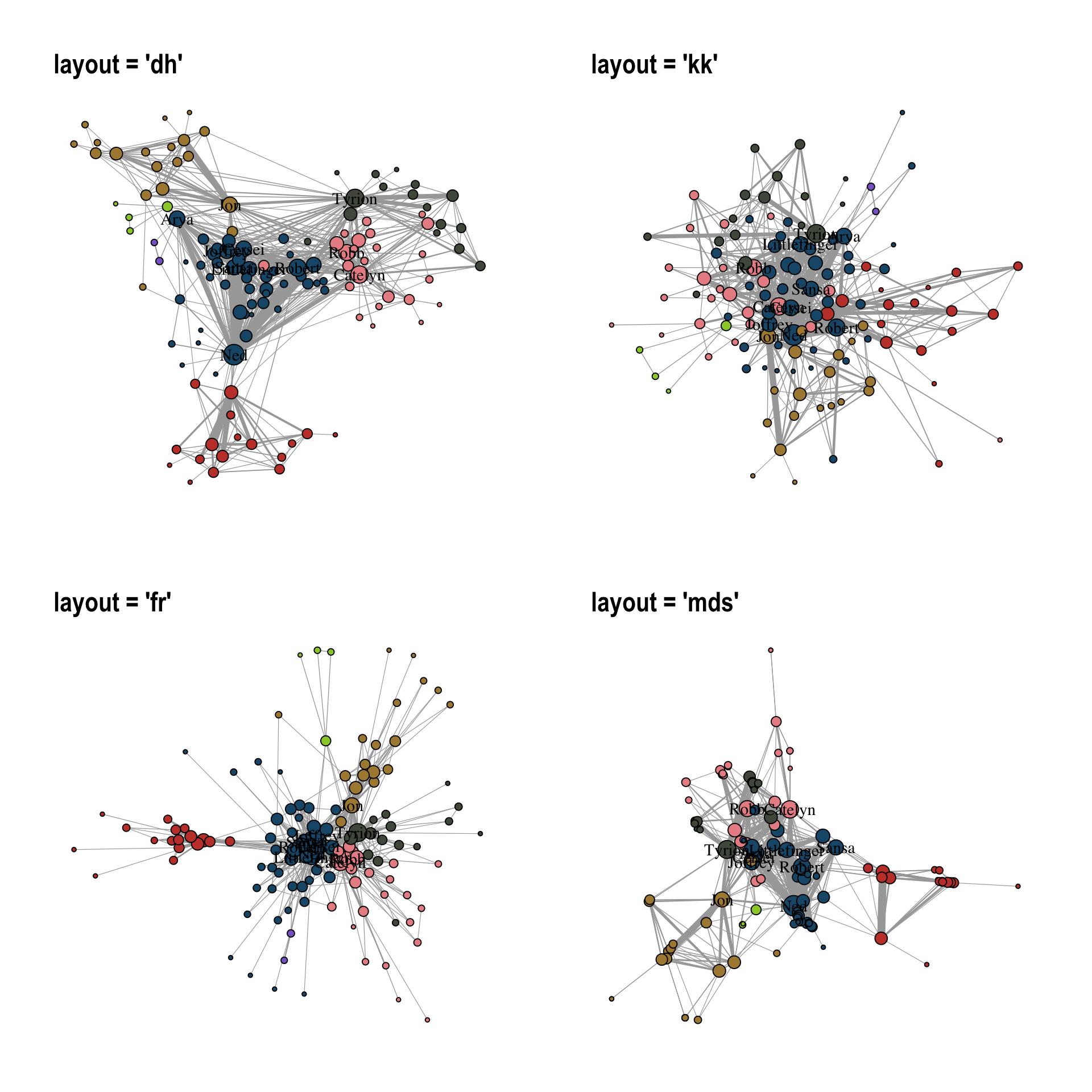
Figure 11.2 illustrates how the choice of layout algorithm affects the appearance of the network. Note that there technically is no right or wrong choice. All layout algorithms are in a sense arbitrary since we can choose x and y coordinates freely as compared to ordinary data visualization where the “layout” is guided by existing “coordinates”. For networks, it is mostly, but not exclusively, about aesthetics.
You can also precompute the layout with the create_layout() function. This makes sense in cases where the calculation of the layout takes very long and you want to play around with other visual aspects.
gotS1_layout <- create_layout(gotS1, "stress")

ggraph(gotS1_layout) +
  ...
11.5 Edges
geom_edge_link0(aes(edge_linewidth = weight), edge_color = "grey66")The second layer specifies how edges are drawn. To do so, we use one of the many edge geoms available in ggraph.
c(
  "geom_edge_arc",
  "geom_edge_arc0",
  "geom_edge_arc2",
  "geom_edge_bundle_force",
  "geom_edge_bundle_path",
  "geom_edge_density",
  "geom_edge_diagonal",
  "geom_edge_diagonal0",
  "geom_edge_diagonal2",
  "geom_edge_elbow",
  "geom_edge_elbow0",
  "geom_edge_elbow2",
  "geom_edge_fan",
  "geom_edge_fan0",
  "geom_edge_fan2",
  "geom_edge_hive",
  "geom_edge_hive0",
  "geom_edge_hive2",
  "geom_edge_link",
  "geom_edge_link0",
  "geom_edge_link2",
  "geom_edge_loop",
  "geom_edge_loop0",
  "geom_edge_parallel"
)
You can do a lot of fancy things with these geoms but for a standard network plot, you should almost always stick with geom_edge_link0 since it simply draws a straight line between the endpoints. Some tools draw curved edges by default. While this may add some artistic value, it also reduces readability. It is best to always go with straight lines. If a network has multiple edges between two nodes, one can switch to geom_edge_parallel() (see Figure 11.3).
g <- make_graph(c(1, 2, 1, 2, 1, 2))

ggraph(g, layout = "stress") +
  geom_edge_parallel(edge_color = "grey66", edge_linewidth = 0.5) +
  geom_node_point(size = 10) +
  theme_graph()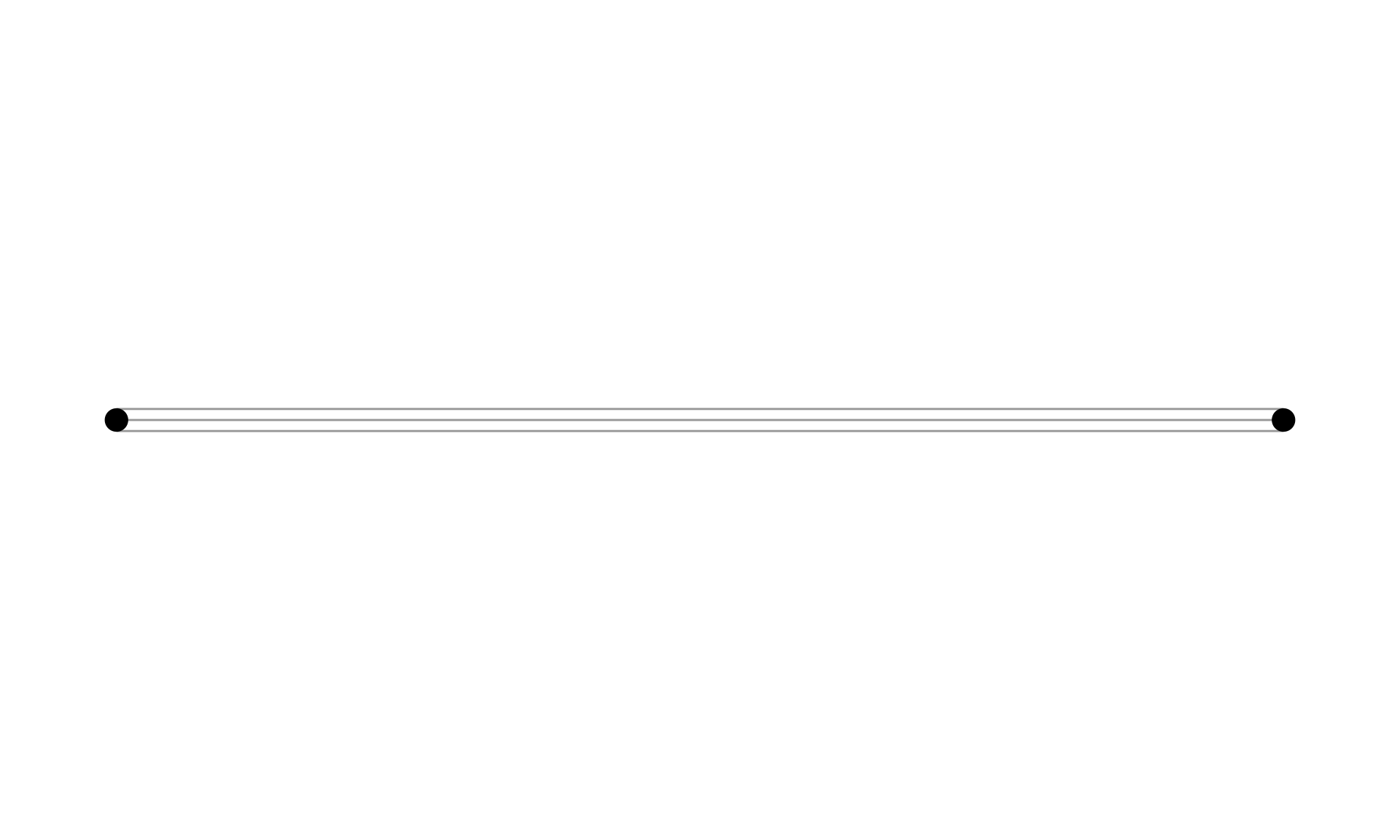
geom_edge_parallel().
The curved equivalent of geom_edge_parallel() is geom_edge_fan(). Figure 11.4 shows the difference between the two.
ggraph(g, layout = "stress") +
  geom_edge_fan(edge_color = "grey66", edge_linewidth = 0.5) +
  geom_node_point(size = 10) +
  theme_graph()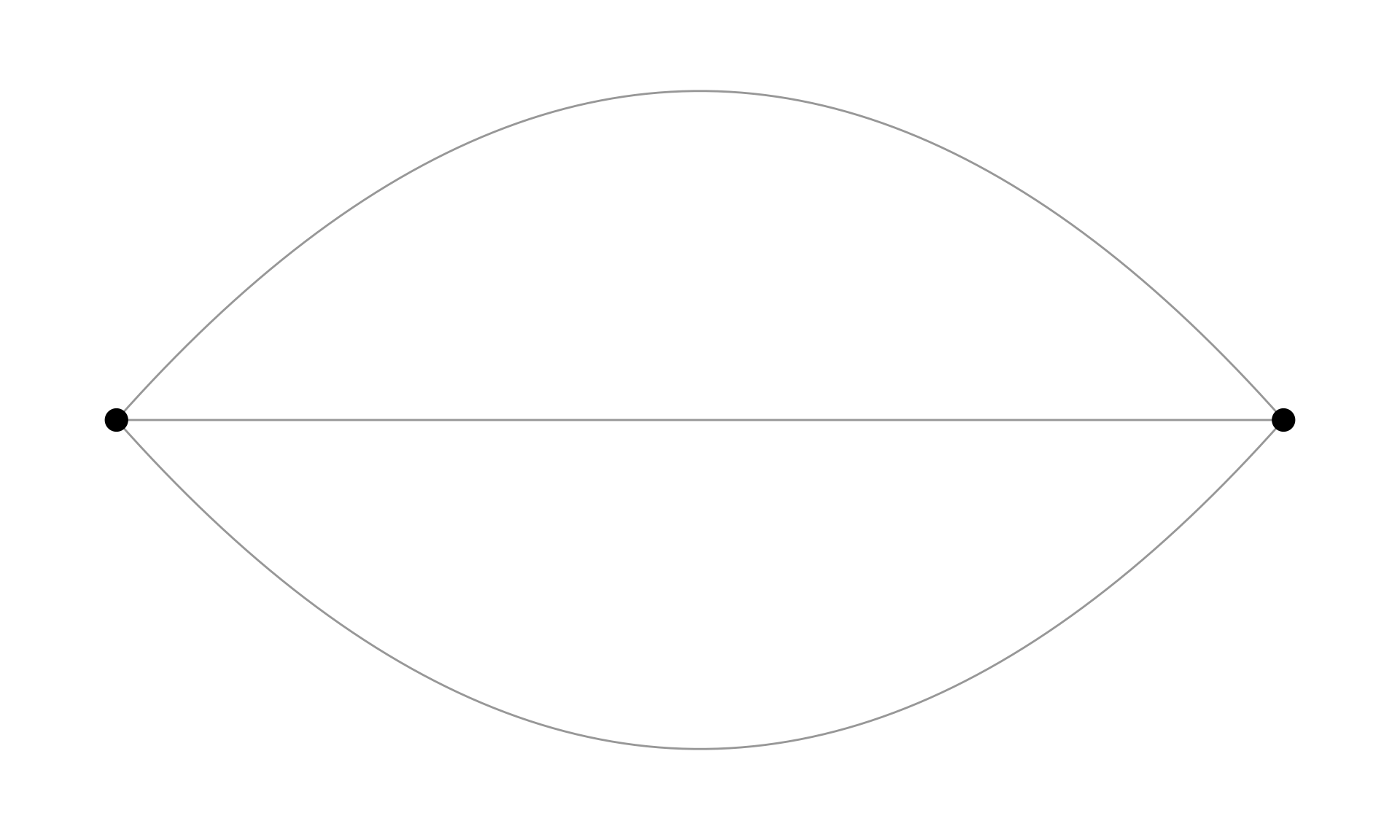
geom_edge_fan().
Most edge geoms come in three flavors. The standard geom_edge_link() draws 100 dots on each edge compared to only two dots (the endpoints) in geom_edge_link0(). This is done to allow gradients along the edge as shown in Figure 11.5.
ggraph(gotS1, layout = "stress") +
  geom_edge_link(
    aes(alpha = after_stat(index)),
    edge_color = "black"
  ) +
  geom_node_point(aes(fill = clu, size = size), shape = 21) +
  scale_fill_manual(values = got_palette) +
  scale_edge_width_continuous(range = c(0.2, 3)) +
  scale_size_continuous(range = c(1, 6)) +
  theme_graph() +
  theme(legend.position = "none")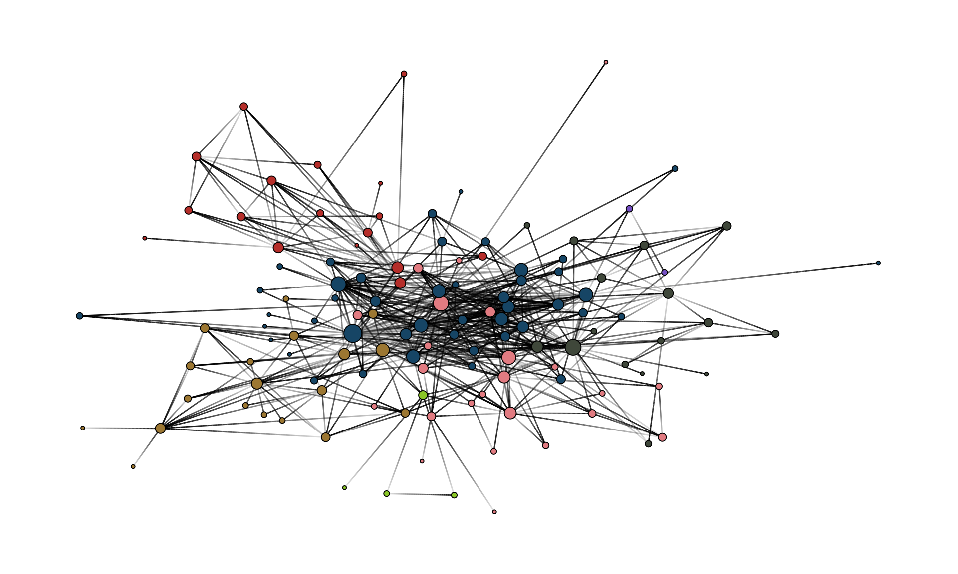
geom_edge_link().
The drawback of using geom_edge_link() is that the time to render the plot increases and so does the size of the file if you export the plot. Typically, you do not need gradients along an edge. Hence, geom_edge_link0() should be the default choice to draw edges.
Within geom_edge_link0, you can specify the appearance of the edge, either by mapping edge attributes to aesthetics or setting them globally for the graph. Mapping attributes to aesthetics is done within aes(). In the example, we map the edge width to the edge attribute “weight”. ggraph then automatically scales the edge width according to the attribute. The color of all edges is globally set to “grey66”.
The following aesthetics can be used within geom_edge_link0 either within aes() or globally:
- edge_color (color of the edge)
- edge_linewidth (width of the edge)
- edge_linetype (linetype of the edge, defaults to “solid”)
- edge_alpha (opacity; a value between 0 and 1)
ggraph does not automatically draw arrows if your graph is directed. You need to do this manually using the arrow parameter.
geom_edge_link0(
  aes(...),
  ...,
  arrow = arrow(
    angle = 30,
    length = unit(0.15, "inches"),
    ends = "last",
    type = "closed"
  )
)
The default arrowhead type is “open”, yet “closed” usually has a nicer appearance (see Figure 11.6).
g <- make_graph(c(1, 2, 2, 3), directed = TRUE)

xy <- matrix(c(0, 0, 1, 0, 2, 0), ncol = 2, byrow = TRUE)

ggraph(g, layout = "manual", x = xy[, 1], y = xy[, 2]) +
  geom_edge_link(
    edge_color = "grey66",
    edge_linewidth = 0.5,
    arrow = arrow(
      angle = 30,
      length = unit(0.15, "inches"),
      ends = "last",
      type = "closed"
    ),
    end_cap = circle(5, 'pt')
  ) +
  geom_node_point(size = 5) +
theme_graph()Note the use of end_cap in the code above. This is needed to avoid that the arrowhead overlaps with the node. The parameter specifies how the edge should end. In this case, we specify a circular cap with a radius of 5 points. This creates a gap between the end of the edge and the node, which allows the arrowhead to be fully visible.
11.6 Nodes
geom_node_point(aes(fill = clu, size = size), shape = 21) +
  geom_node_text(aes(filter = size >= 26, label = name), family = "serif")
On top of the edge layer, the node layer is drawn. Always draw the node layer above the edge layer. Otherwise, edges will be visible on top of nodes which leads to a messy and less readable plot. There are slightly less geoms available for nodes.
c(
  "geom_node_arc_bar",
  "geom_node_circle",
  "geom_node_label",
  "geom_node_point",
  "geom_node_text",
  "geom_node_tile",
  "geom_node_treemap"
)
The most important ones here are geom_node_point() to draw nodes as simple geometric objects (circles, squares,…) and geom_node_text() to add node labels. You can also use geom_node_label(), which draws labels within a box.
The mapping of node attributes to aesthetics is similar to edge attributes. In the example code, we map the fill attribute of the node shape to the “clu” attribute, which holds the result of a clustering, and the size of the nodes to the attribute “size”. The shape of the node is globally set to 21.
Figure 11.7 shows all possible shapes that can be used for the nodes.
shapes <- data.frame(
  shape = 0:25,
  x = rep(0:6, length.out = 26),
  y = -rep(0:3, each = 7, length.out = 26)
)

ggplot(shapes, aes(x, y)) +
  geom_point(aes(shape = shape), size = 5, fill = "grey70") +
  geom_text(aes(label = shape), nudge_y = 0.3) +
  scale_shape_identity() +
  expand_limits(y = 0.6) +
  theme_void()
color), while shapes 21-25 have both a border (color) and a fill (fill).
For networks, “21” is a solid choice since it draws a border around the nodes. If other shapes are used, say “19”, several things need to be considered. To change the color of shapes 1-20, the color parameter needs to be set. For shapes 21-25 the fill parameter. The color parameter only controls the border for these cases.
The following aesthetics can be used within geom_node_point() either within aes() or globally:
- alpha (opacity; a value between 0 and 1)
- color (color of shapes 0-20 and border color for 21-25)
- fill (fill color for shape 21-25)
- shape (node shape; a value between 0 and 25)
- size (size of node)
- stroke (size of node border)
For geom_node_text(), there are a lot more options available, but the most important ones are:
- label (attribute to be displayed as node label)
- color (text color)
- family (font to be used)
- size (font size)
Note that we also used a filter within aes() of geom_node_text(). The filter parameter allows one to specify a rule for when to apply the aesthetic mappings. The most frequent use case is for node labels (but can also be used for edges or nodes). In the example, the node label is only displayed if the size attribute is larger than 26.
Because ggraph stores the node layout in a data frame accessible to every layer, geoms from other packages that operate on standard x/y aesthetics (e.g. geom_mark_hull() from ggforce, geom_shadowtext() from shadowtext) can be layered on top of a network plot. We will make use of this in later chapters.
11.7 Scales
scale_fill_manual(values = got_palette) +
  scale_edge_width_continuous(range = c(0.2, 3)) +
  scale_size_continuous(range = c(1, 6))
The scale_* functions are used to control aesthetics that are mapped within aes(). Setting those are optional, since ggraph can take care of it automatically as shown in Figure 11.8.
ggraph(gotS1, layout = "stress") +
  geom_edge_link0(
    aes(edge_linewidth = weight),
    edge_color = "grey66"
  ) +
  geom_node_point(aes(fill = clu, size = size), shape = 21) +
  geom_node_text(
    aes(filter = size >= 26, label = name),
    family = "serif"
  ) +
  theme_graph() +
  theme(legend.position = "none")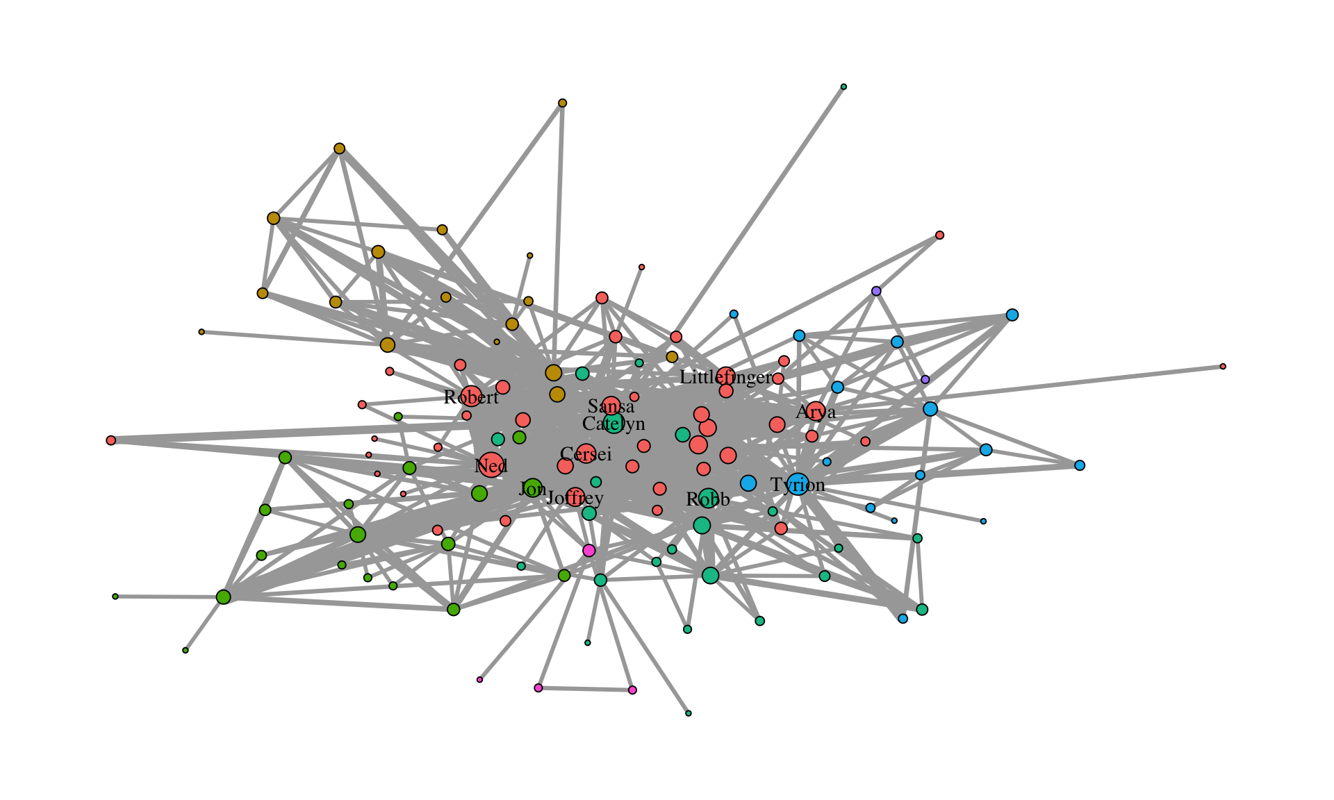
While the node fill and size seem reasonable, the edges are, however, a little too thick. In general, it is always a good idea to add a scale_* for each aesthetic mapping within aes().
What kind of scale_* function is needed depends on the aesthetic and on the type of attribute. Generally, scale functions are structured as
scale_<aes>_<variable type>().
The “aes” part is easy. It is the type specified within aes(). For edges, however, edge_ needs to be prepended to the aesthetic name. The “variable type” depends on which scale the attribute is on. The following table gives an overview of which aesthetics can be used for which variable type and some notes on when to use which aesthetic.
| aesthetic | variable type | notes |
|---|---|---|
| node size | continuous | |
| edge width | continuous | |
| node color/fill | categorical/continuous | use a gradient for continuous variables |
| edge color | continuous | categorical only if there are different types of edges |
| node shape | categorical | only if there are a few categories (1-5). Color should be the preferred choice |
| edge linetype | categorical | only if there are a few categories (1-5). Color should be the preferred choice |
| node/edge alpha | continuous |
The easiest to use scales are those for continuous variables mapped to edge width and node size (also the alpha value, which is not used here). While there are several parameters within scale_edge_width_continuous() and scale_size_continuous(), the most important one is “range” which fixes the minimum and maximum width and size respectively. In most cases it suffices to only adjust this parameter.
For continuous variables which are mapped to node/edge color, one can use scale_color_gradient() scale_color_gradient2() or scale_color_gradientn() (add edge_ before color for edge colors). The difference between these functions is in how the gradient is constructed. gradient creates a two color gradient (low-high). So just two colors need to be specified (e.g. low = "blue", high = "red"). gradient2 creates a diverging color gradient (low-mid-high) (e.g. low = "blue", mid = "white", high = "red") and gradientn a gradient consisting of more than three colors (specified with the colors parameter).
For categorical variables that are mapped to node colors (or fill in our example), one can use scale_fill_manual() to choose a color for each category manually. To do so, create a vector of colors (like the got_palette) and pass it to the function with the parameter values.
ggraph then assigns the colors in the order of the unique values of the categorical variable. This are either the factor levels (if the variable is a factor) or the result of sorting the unique values (if the variable is a character).
sort(unique(V(gotS1)$clu))[1] "1" "2" "3" "4" "5" "6" "7"To avoid automatic assignment of colors, one can pass the vector of colors as a named vector. The difference between unnamed and named palettes is shown in Figure 11.9.
got_palette2 <- c(
  "5" = "#1A5878",
  "3" = "#C44237",
  "2" = "#AD8941",
  "1" = "#E99093",
  "4" = "#50594B",
  "7" = "#8968CD",
  "6" = "#9ACD32"
)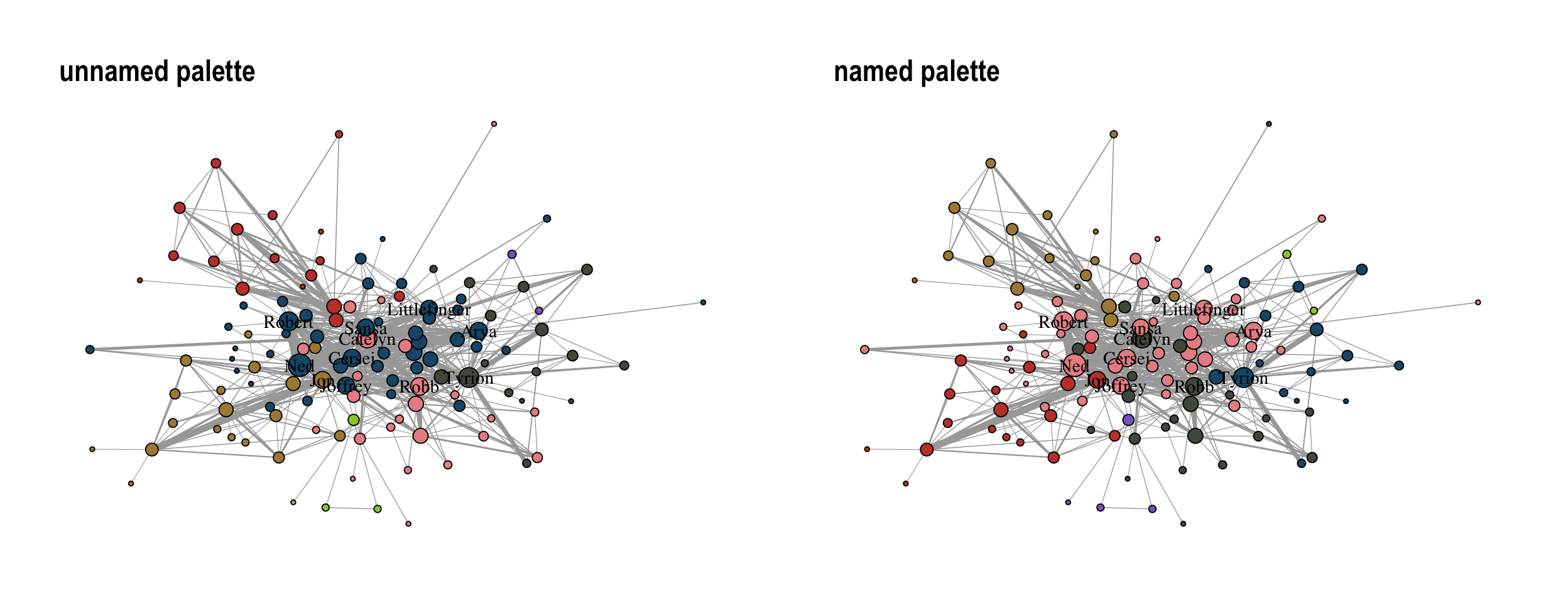
Using a manual color palette gives the network a unique touch but scale_fill_brewer() and scale_color_brewer() can also be used to apply predefined color palettes.
The function offers all palettes available at colorbrewer2.org. An example is shown in Figure 11.10.
ggraph(gotS1, layout = "stress") +
  geom_edge_link0(
    aes(edge_linewidth = weight),
    edge_color = "grey66"
  ) +
  geom_node_point(aes(fill = clu, size = size), shape = 21) +
  geom_node_text(
    aes(filter = size >= 26, label = name),
    family = "serif"
  ) +
  scale_fill_brewer(palette = "Dark2") +
  scale_edge_width_continuous(range = c(0.2, 3)) +
  scale_size_continuous(range = c(1, 6)) +
  theme_graph() +
  theme(legend.position = "none")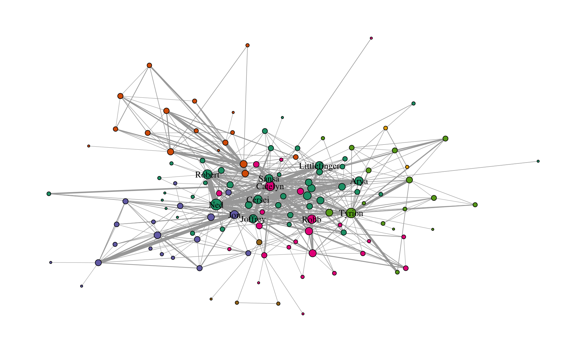
11.8 Themes
theme_graph() +
  theme(legend.position = "none")
Themes control the overall look of the plot. There are a lot of options within the theme() function of ggplot2. However, there is really no need to use any of those. theme_graph() is used to erase all of the default ggplot theme (e.g., axis, background, grids, etc.) since they are irrelevant for networks. The only option worthwhile in theme() is legend.position, which we set to "none", i.e., do not show the legend.
Figure 11.11 gives an example for a plot with a legend.
ggraph(gotS1, layout = "stress") +
  geom_edge_link0(
    aes(edge_linewidth = weight),
    edge_color = "grey66"
  ) +
  geom_node_point(aes(fill = clu, size = size), shape = 21) +
  geom_node_text(
    aes(filter = size >= 26, label = name),
    family = "serif"
  ) +
  scale_fill_manual(values = got_palette) +
  scale_edge_width_continuous(range = c(0.2, 3)) +
  scale_size_continuous(range = c(1, 6)) +
  theme_graph() +
  theme(legend.position = "bottom")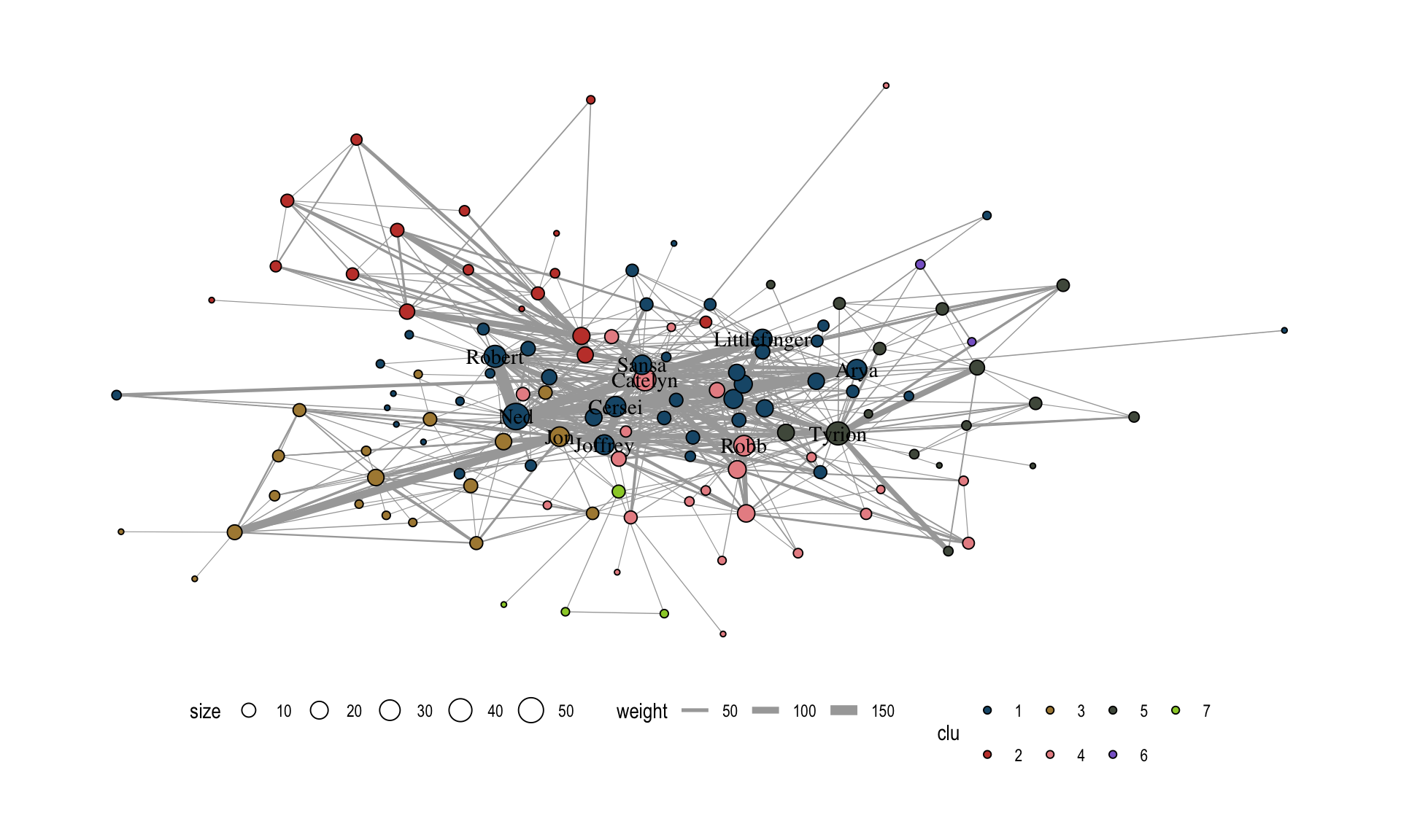
This covers all the necessary steps to produce a standard network plot with ggraph. More advanced techniques will be covered in the next sections. We will conclude the introductory part by recreating a famous network visualization using ggraph to see how the different components work together in practice.
11.9 Use case: Political Blogs
In this section, we recreate the figure shown in Figure 11.12.
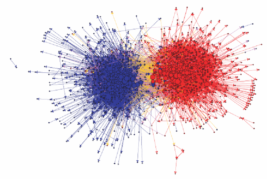
The network shows the linking between political blogs during the 2004 election in the US. Red nodes are conservative leaning blogs and blue ones liberal.
The dataset is included in the networkdata package.
data("polblogs")

# add a vertex attribute for the indegree
V(polblogs)$deg <- degree(polblogs, mode = "in")
We start with a simple plot without any styling as shown in Figure 11.13.
lay <- create_layout(polblogs, "stress")

ggraph(lay) +
  geom_edge_link0(
    edge_linewidth = 0.2,
    edge_color = "grey66",
    arrow = arrow(
      angle = 15,
      length = unit(0.15, "inches"),
      ends = "last",
      type = "closed"
    )
  ) +
  geom_node_point()
As a first cleanup step, we delete all isolates nodes and the small disconnected component (see Figure 11.14).
polblogs <- delete_vertices(polblogs, which(degree(polblogs) == 0))

comps <- components(polblogs)
polblogs <- delete_vertices(
  polblogs,
  which(comps$membership == which.min(comps$csize))
)


lay <- create_layout(polblogs, "stress")

ggraph(lay) +
  geom_edge_link0(
    edge_linewidth = 0.2,
    edge_color = "grey66",
    arrow = arrow(
      angle = 15,
      length = unit(0.1, "inches"),
      ends = "last",
      type = "closed"
    )
  ) +
  geom_node_point()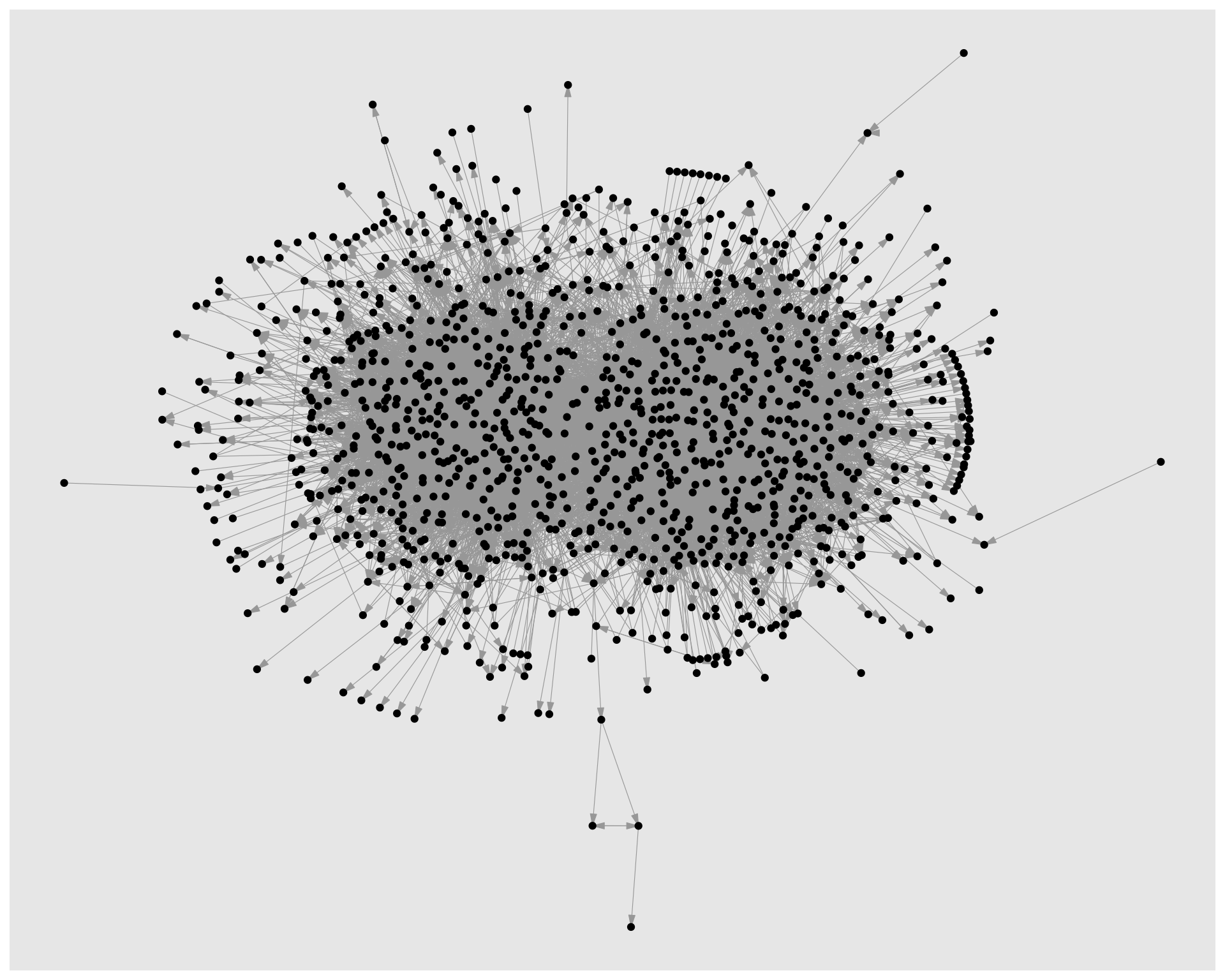
Figure 11.15 shows the network with styling applied to the nodes. Political orientation is mapped to node color and indegree to node size. The colors are manually set to match the original visualization and the size range is adjusted to make the differences in node size more visible.
ggraph(lay) +
  geom_edge_link0(
    edge_linewidth = 0.2,
    edge_color = "grey66",
    arrow = arrow(
      angle = 15,
      length = unit(0.15, "inches"),
      ends = "last",
      type = "closed"
    )
  ) +
  geom_node_point(
    shape = 21,
    aes(fill = pol, size = deg),
    show.legend = FALSE
  ) +
  scale_fill_manual(
    values = c("left" = "#104E8B", "right" = "firebrick3")
  ) +
  scale_size(range = c(0.5, 7))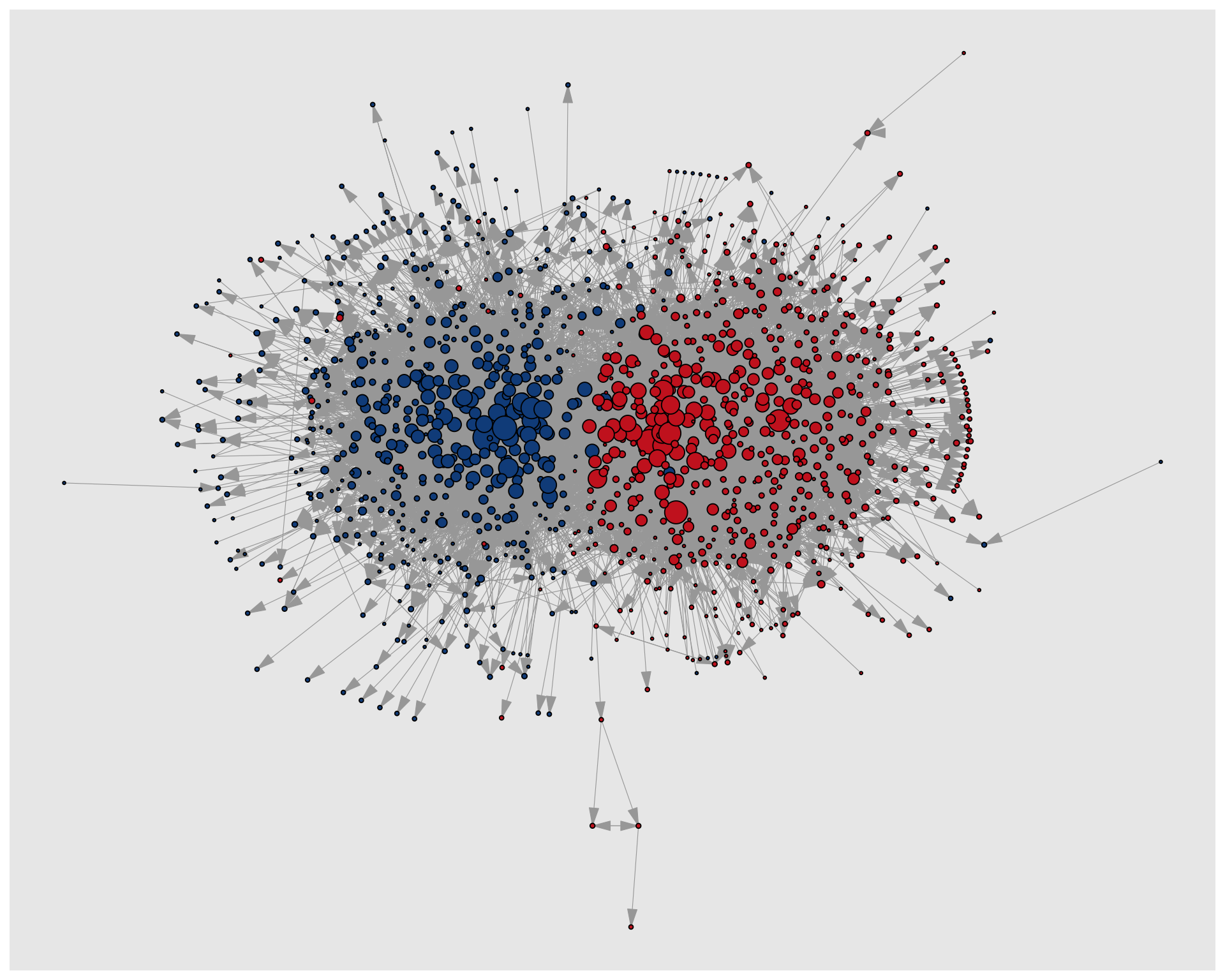
Now we move on to the edges. This is a bit more complicated since we have to create an edge variable first which indicates if an edge is within or between political orientations. This new variable is mapped to the edge color (Figure 11.16).
pol_from <- V(polblogs)$pol[tail_of(polblogs, E(polblogs))]
pol_to <- V(polblogs)$pol[head_of(polblogs, E(polblogs))]
E(polblogs)$col <- ifelse(pol_from == pol_to, pol_from, "mixed")


lay <- create_layout(polblogs, "stress")
ggraph(lay) +
  geom_edge_link0(
    edge_linewidth = 0.2,
    aes(edge_color = col),
    arrow = arrow(
      angle = 10,
      length = unit(0.1, "inches"),
      ends = "last",
      type = "closed"
    )
  ) +
  geom_node_point(
    shape = 21,
    aes(fill = pol, size = deg),
    show.legend = FALSE
  ) +
  scale_fill_manual(
    values = c("left" = "#104E8B", "right" = "firebrick3")
  ) +
  scale_edge_color_manual(
    values = c(
      "left" = "#104E8B",
      "mixed" = "goldenrod",
      "right" = "firebrick3"
    )
  ) +
  scale_size(range = c(0.5, 7))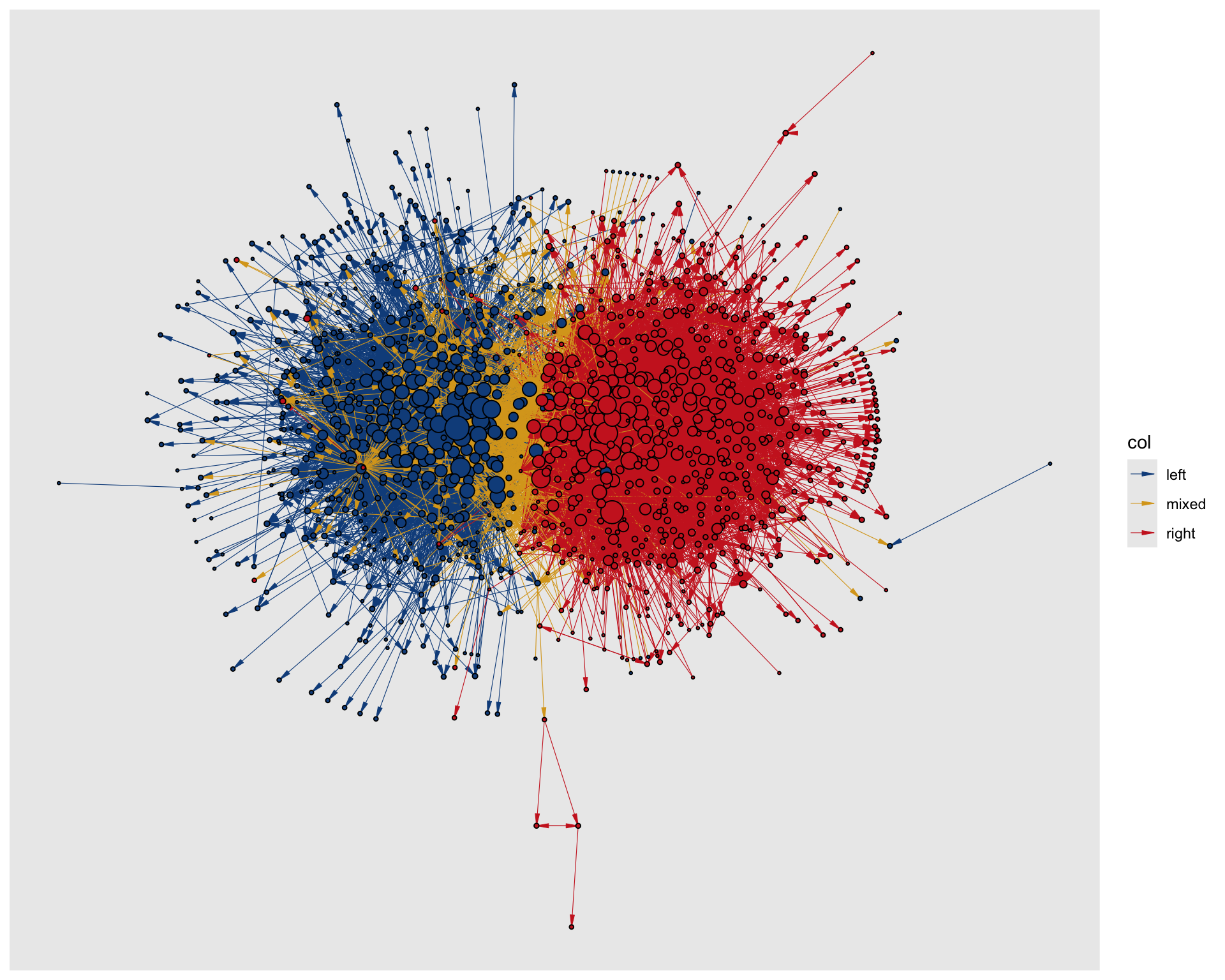
Almost finished but it seems there are a lot of yellow edges which run over blue edges. It looks as if these should run below according to the original viz. To achieve this, there are different options, but we use a filter trick here. We add two geom_edge_link0() layers: First, for the mixed edges and then for the remaining edges. In that way, the mixed edges are plotted first and thus below the intra group edges as seen in Figure 11.17.
ggraph(lay) +
  geom_edge_link0(
    edge_linewidth = 0.2,
    aes(filter = (col == "mixed"), edge_color = col),
    arrow = arrow(
      angle = 10,
      length = unit(0.1, "inches"),
      ends = "last",
      type = "closed"
    ),
    show.legend = FALSE
  ) +
  geom_edge_link0(
    edge_linewidth = 0.2,
    aes(filter = (col != "mixed"), edge_color = col),
    arrow = arrow(
      angle = 10,
      length = unit(0.1, "inches"),
      ends = "last",
      type = "closed"
    ),
    show.legend = FALSE
  ) +
  geom_node_point(
    shape = 21,
    aes(fill = pol, size = deg),
    show.legend = FALSE
  ) +
  scale_fill_manual(
    values = c("left" = "#104E8B", "right" = "firebrick3")
  ) +
  scale_edge_color_manual(
    values = c(
      "left" = "#104E8B",
      "mixed" = "goldenrod",
      "right" = "firebrick3"
    )
  ) +
  scale_size(range = c(0.5, 7))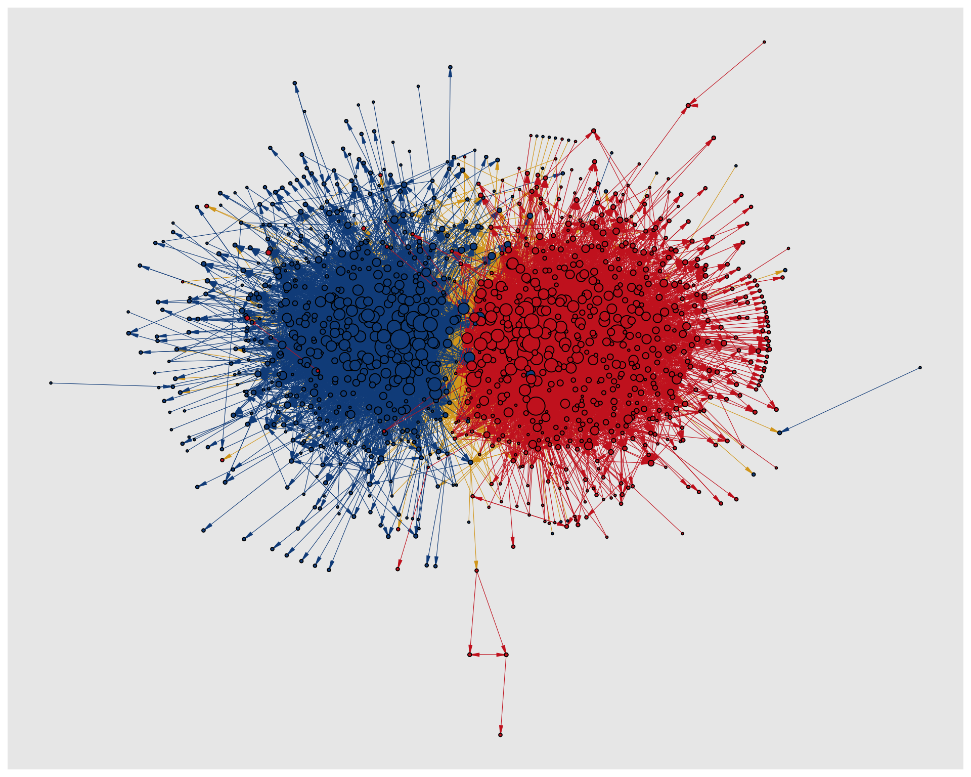
Finally, we add the theme_graph() in Figure 11.18 to finalize the plot.
ggraph(lay) +
  geom_edge_link0(
    edge_linewidth = 0.2,
    aes(filter = (col == "mixed"), edge_color = col),
    arrow = arrow(
      angle = 10,
      length = unit(0.1, "inches"),
      ends = "last",
      type = "closed"
    ),
    show.legend = FALSE
  ) +
  geom_edge_link0(
    edge_linewidth = 0.2,
    aes(filter = (col != "mixed"), edge_color = col),
    arrow = arrow(
      angle = 10,
      length = unit(0.1, "inches"),
      ends = "last",
      type = "closed"
    ),
    show.legend = FALSE
  ) +
  geom_node_point(
    shape = 21,
    aes(fill = pol, size = deg),
    show.legend = FALSE
  ) +
  scale_fill_manual(
    values = c("left" = "#104E8B", "right" = "firebrick3")
  ) +
  scale_edge_color_manual(
    values = c(
      "left" = "#104E8B",
      "mixed" = "goldenrod",
      "right" = "firebrick3"
    )
  ) +
  scale_size(range = c(0.5, 7)) +
  theme_graph()
theme_graph().
References
Adamic, Lada A, and Natalie Glance. 2005. “The Political Blogosphere and the 2004 US Election: Divided They Blog.” Proceedings of the 3rd International Workshop on Link Discovery, 36–43.